Sending a press release like we used to 15 years ago is a dying practice. Communications departments and fashion, luxury and cosmetics agencies are evolving. They're finding new ways to communicate, ways that resonate much more with the way we spread our messages on social, or interact with journalists, influencers, consumers, and users.
"53% of users claim that they receive too many irrelevant emails", according to our eBook PR Like a Pro: Emailing Do's & Don'ts for Fashion, Luxury & Cosmetic Brands. Which is why when it comes to emailing tactics, there are two trends that have emerged. Firstly, we have the rise of personalization, which consists in adapting the message to each recipient so as to meet their needs and capture their attention. Secondly, visual elements have become more crucial than ever. Whether through email, social media, traditional press, or television, brands have understood that sharing impacting messages is much more effective when using visual graphics and other creative elements.
Some time ago we wrote a post offering up Tips for Writing your Press Release. Today, we're focusing on an essential element you should bear in mind when emailing: the image. When contacting an audience that is increasingly swamped by emails, incorporating good visuals will help you improve your open and click rates. Here are 7 keys to making your press releases more visual.
In this article you’ll learn…
1. Use images to visually support your information.
Many companies continue concentrating all of their efforts on writing endless paragraphs in their press notes without using a single visual element. This makes it harder for journalists who communicate with a visually stimulated audience. And, when it comes to collection presentations or new product announcements, the process seems eternal: the journalist receives a "pretty" email, but without access to a gallery of products. Then they must write to the brand to request high quality images or look books. The brand then sends a folder of images via email, which are too heavy to download, so the journalist then receives a WeTransfer or Dropbox link... sound familiar?
That's why we recommend always using visuals directly in your email to tell your story. If it's about about a collection presentation don't limit yourself to one image. Take advantage of the possibility of using different sections to highlight the most important pieces, and offer your recipients direct access to your digital showroom via a link within your email. We've included an example of a press release around a product launch below:
|
|
||
|
![]()
|
 |
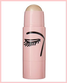
DEFINE GLOWRadiance - enhancing plant root enlivens cheeks with a healthy pinch-your-cheeks flush. The face will look instantly fresh and radiant. |
 |
SWEET TRADITIONUnveil smoother, softer lips. This lipstick sugar-based treatment hydrates, nourishes, and protects - and now comes in a perfect nude-pink hue. |
Always think of the specific formats that the media would need in order to publish information on their web and socials accounts. Make their lives easier by offering journalists direct access to downloadable images, galleries, videos and other materials. You'll save time (yours and theirs), not to mention take better advantage of editorial opportunities!
2. Press releases for events: use visual formats.
Press releases or invites to events are still the most used tools to get press and other contacts to attend events. That's why grabbing the invitee's attention is essential, and the visual elements in your invite play a key role in this.
Make sure to visually highlight the date of the event, as well as the venue where it will be taking place. And, don't forget to include a link in your email to the registration or confirmation (RSVP) page - make it easy for your invitees to sign up! Connecting these emails to an events management tool will allow you to keep track of your contacts' confirmation status in real time. Here's a great example of an event press release for emails:
|
|
||
|
AERIN Southampton
83 Main Street
Southampton
![]()
3. Use the 'Call to Action' to highlight relevant information.
Especially when it comes to events, or other online content you'd like to direct the journalist to (videos, for instance). Use visual elements with highlighted boxes, buttons and icons to create a real "call to action".
Call to Action (CTA) buttons are crucial if you're looking to attract your audience, and measure the effectivity of your campaigns. A good CTA should directly communicate the action you want the user to take (and the urgency) in no more than 3 words. If you include a link to an image gallery or your website, make sure to design and place it carefully so that it visually compels the recipient to follow through with the action.
![]() Learn more about creating relevant CTAs before sending your press release by downloading our free eBook: PR Like a Pro: Emailing Do's & Don'ts for Fashion, Luxury & Cosmetic Brands.
Learn more about creating relevant CTAs before sending your press release by downloading our free eBook: PR Like a Pro: Emailing Do's & Don'ts for Fashion, Luxury & Cosmetic Brands.
Banners within the text can also enrich the navigation experience for the journalist when reading through your press release. You can use banners to redirect them to a complementary infographic, a document, or your brand's webpage.
The important thing is that they not interfere with the information your providing, rather complement it (just like in blogs or other online content). In this infographic you'll find some helpful advice on how to optimize your CTAs:

Fuente: brandongaille.com
4. Include images of the people you mention in your press release.
There may be journalists who aren't so interested, yet others who will need more information on your company's spokesperson(s) or other professionals, celebrities, influencers... who are involved in the event. When sending press notes it's never a bad idea to include pictures of those mentioned, as well as links to their professional profiles. This way, journalists who receive your invitation or press release will know who is who, and therefore accurately report on them.

Example of an email sent by Women's Conference of Florida 2016
5. Why not use a GIF in your emails?
GIFs are now heavily associated with fun content that users share on their social media accounts. However, it would be a mistake to limit a GIF's potential to this. GIF means Graphic Interchange Format, a format for animated images. Don't be afraid of using these to personalize the design of your communications or press releases, rather than just using static images.
Below, you'll see an example of a collection launch being presented in an animated image, making for a more dynamic campaign email. Press notes take on a lighter, more fun feel with this format:
|
|
|||||||||||
|
6. Think about which device your target consumer uses before sending the press release.
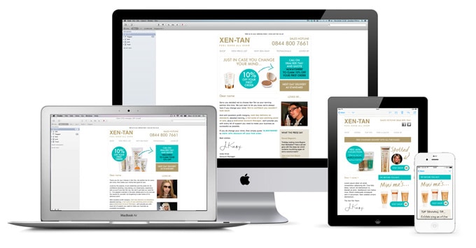
Who are the individuals who are receiving your communications and press notes? Do they sit at a desk all day? Are they constantly on the go? Think about who your audience is, and adapt your emails to their needs so that no matter the device the journalist or influencer uses, your emails will always look great. An emailing platform with a drag-and-drop feature to build personalized emails with press release templates – and with responsive formats – is the most recommendable type of digital tool. Not only will this offer you more possibilities when it comes to designing and structuring your emails (without having to worry about HTML!), but it will also make your communications adaptable to any device: mobile phones, tablets or computers – which means your invitation or press note will always look incredible, no matter which gadget your recipient is using.

Example of a responsive email that adapts to all devices.
7. Use the right emailing platform to easily design your press communications.
If you're not a Photoshop guru or HTML programmer, it isn't always easy to send visually attractive invites or press releases. Luckily, there are advanced emailing platforms that are intuitive and will make the whole process flawless. You can send your communications in a matter of minutes, without any technical problems! Choose a platform that is tailored to PR and communication departments' needs, and you'll feel right at home 😉
Here are some examples of how you can make the most of the visual aspect of your press notes, invites and communications. And, to finalize, I'm offering up some advice on what you should bear in mind when it comes to incorporating images in your emails:
- Use the 'text + image' mix to your advantage (steer away from designs based on a sole image).
- Harmonize all of the elements in your press notes (make sure there's a balance between the images and text, use colors from the same palette, etc.)
- Use a system that will support high res images (a server or emailing platform), so that when you send press notes they don't end up in your contacts' spam.
- Think of how we consume information online: use images to complement your news.
Do you have a good example of a press release (version 2.0)? Do you want to start sending more interactive press releases?


